
MELLOW HOME
Mellow Home can help you transform your space without sacrificing function and style.
PROJECT TIMELINE
4 Weeks
METHOD
Screener Survey
User Interviews
Affinity Mapping
Competitive Matrix
Design Studio
Prototype Design
Usability Testing
Photoshop/Illustrator
Sketch
Invision
DELIVERABLES
Project Proposal
Persona
Competitive Analysis
Task Flow
Wireframes with Annotations
Usability Testing Report
Functional Prototype
Style Guide
Client Presentation Deck
OVERVIEW
My team and I were asked to develop a responsive website that’s under the topic of health. After going through many topics within the health categories such as fitness, nutrition, addiction and mental health. We have decided to focus on exploring health for the human mind because we believe many people are feeling stressed now days and this is a problem area we can explore and can help a lot of people to solve their issues.
Manage time and return to work in a better frame of mind.
OVERVIEW
Our team has identified an opportunity related to the frustration people experience while furnishing and decorating their living space. We developed a mobile platform that serves as an interior design tool that can assist users in making informed purchasing decisions in a convenient way.
WHY MOBILE
We have chosen mobile platform because we see mobility to be of great importance in any user experience involving interior design. 6/6 users stated they begin their design or research process on their phone
Ability to move around their apartment or house from room to room while creating their space.
Mobile Integrated capabilities that allow users to interact with their space.
- GPS/accelerometer/proximity sensor
- High quality cameras
RESEARCH
HYPOTHESIS
We believe that creating an interior design tool for people who are living in the big city with small space can help them to maximize the usage of their living space and looking stylish at the same. This will increase comfort in a user’s home through good design and fully optimize full the potential of their limited space.
COMPETITIVE RESEARCH
From the competitive matrix and feature competitive analysis we identified three main features that can distinguish our app compare to others that's on the market.
COMPETITIVE MATRIX
GENERAL
CONTENT


COMMERCE

( Measurement specific )

Palette Cam App
( Color specific )
PERSONALIZED
FEATURE COMPETITIVE ANALYSIS

IDENTIFY FEATURES
Three must have features from competitive research :
Most optimized furniture layout.

Suggesting items to optimize space.

Detect room shape and size within app.

RESEARCH
USER INTERVIEW
We conducted 6 interviews with people in the age range from 21–45 who are residents of new york city.
Feel claustrophobic when I’m in an overcrowded space.
5/6 Users
Like empty space, but the room in my apartment is very limited and I have too many personal belongings.
4/6 Users
Want my room to be clean, comfortable and aesthetically pleasing.
6/6 Users
Want my apartment to be more organized, but I don’t know how and where to start.
6/6 Users
Here are some quotes from the interviews:
"I love my apartment, but I just have so much stuff. I don’t know where to start.”
(User 2, User Interviews)
"I have so many clothes and such a small apartment. It’s so stressful.”
(User 5, User Interviews)
SYNTHESIS
We used affinity map to synthesis the data from our user interviews to identify the main persona and define problem statement.
AFFINITY MAP


PERSONA

PROBLEM STATEMENT
A common need for a comfortable and stylish home is to have a space that is clean and open, but apartments in a big city are usually small and the amount of room for a person’s belongings is limited.
Gavin likes his rented studio apartment, but is struggling with his limited space.
How might we help him utilize the potential of his living space to create a home that is comfortable and aesthetically pleasing for him?
DEFINE THE PROBLEM

DESIGN
DESIGN STUDIO
Our team held 2 round of Design Studios and finalized our low-fi wireframes on the whiteboard together. In the process of design studios, we always tried to think of the needs and pain points of the persona and also the problem statement in order to make sure we didn’t lose the direction while brainstorming.
MID-FI WIREFRAME
Here are mid-fi wireframes of the three must have features for our app:
-Most optimized furniture layout
-Suggesting items to optimize space
-Detecting room shape and size with in app
Must have features in mid-fi wireframe

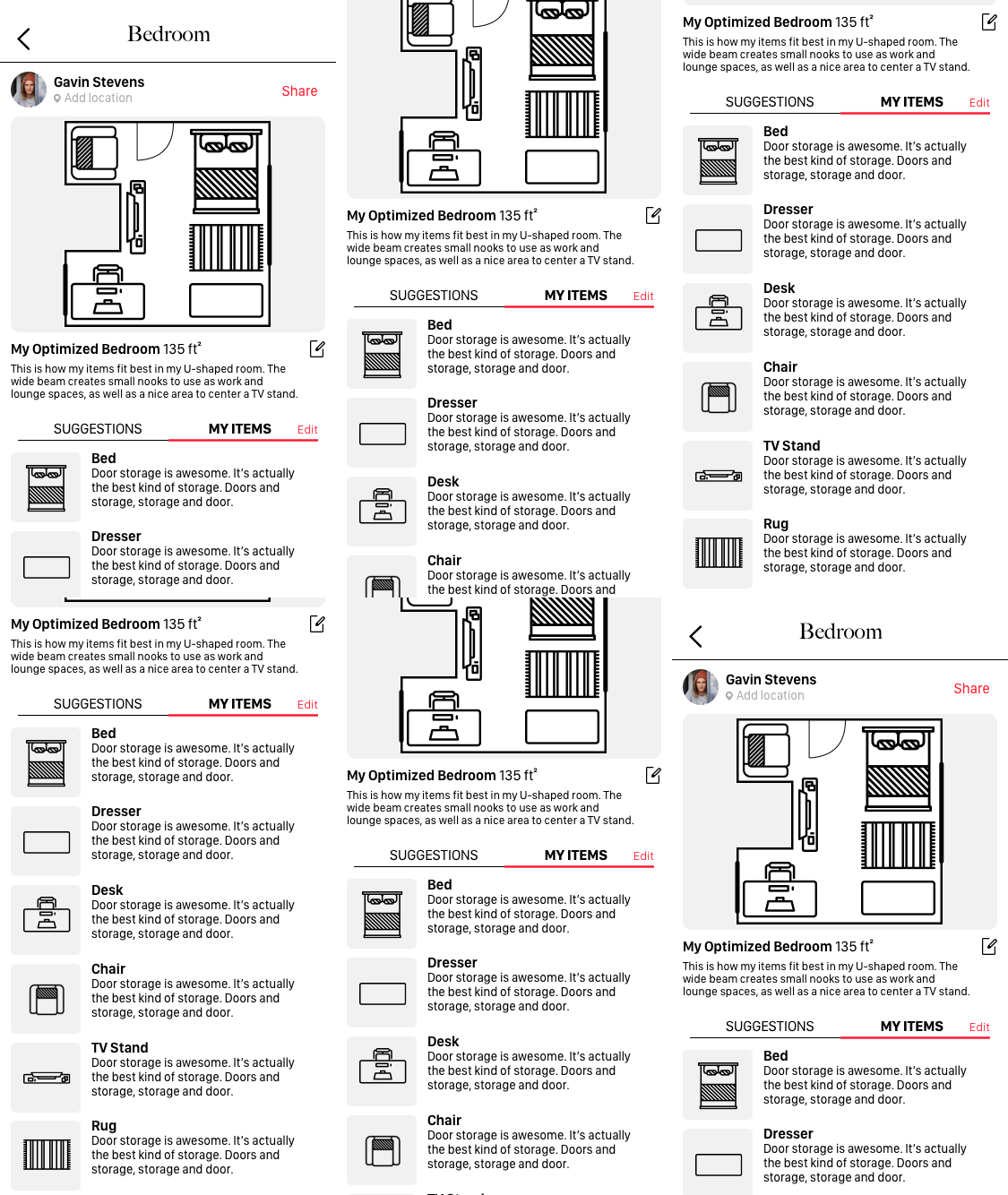
Most optimized furniture layout.
A 2-D bird-view optimized
layout of the room. Users can
easily adjust their own items
according to the picture.

A list of furniture/products that can help optimize user's space is provided. The list include names, photos and short descriptions of all the items.
Suggesting items to optimize space.
Detect room shape and size within app.
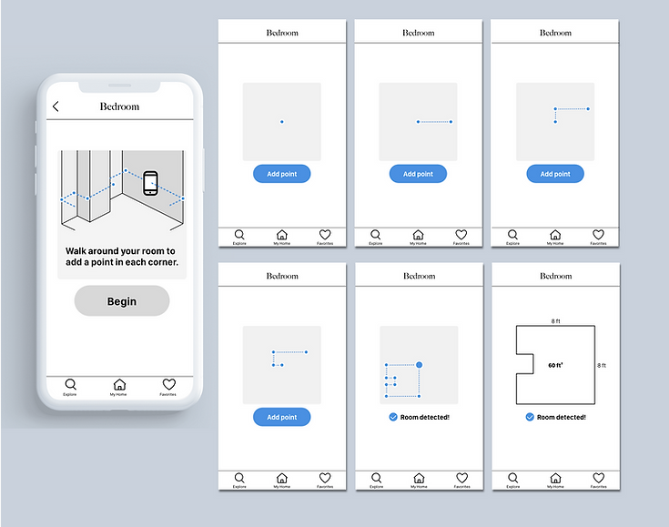
An image that shows users how
to use the detector. Instead of
choosing to use texts to explain,
we decided that using visual aids
will help users understand easier
and faster.
Once the shape of the room is
detected, the measurement of
the room shows afterwards.
A dot is added each time the user
clicks “Add point”. The dotted lines
represent the walls in the room.
User tabs “Add point” every time
when walking to a corner.
DESIGN
HI-FI WIREFRAME
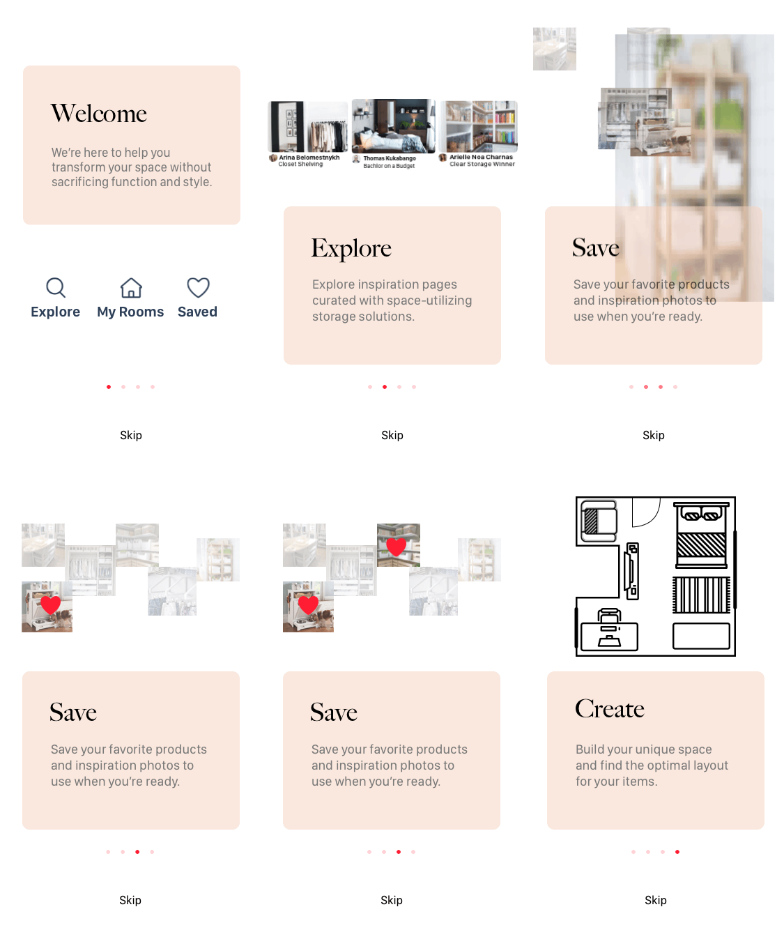
For our hi-fi wireframes, we created a on-boarding feature to high light the key functionalities and made sure to showcase the three main features that distinguishes our app.
FURNITURE LAYOUT
User will see an optimized layout of the room and reasons on how and why the space can be optimize by adapting the layout about.
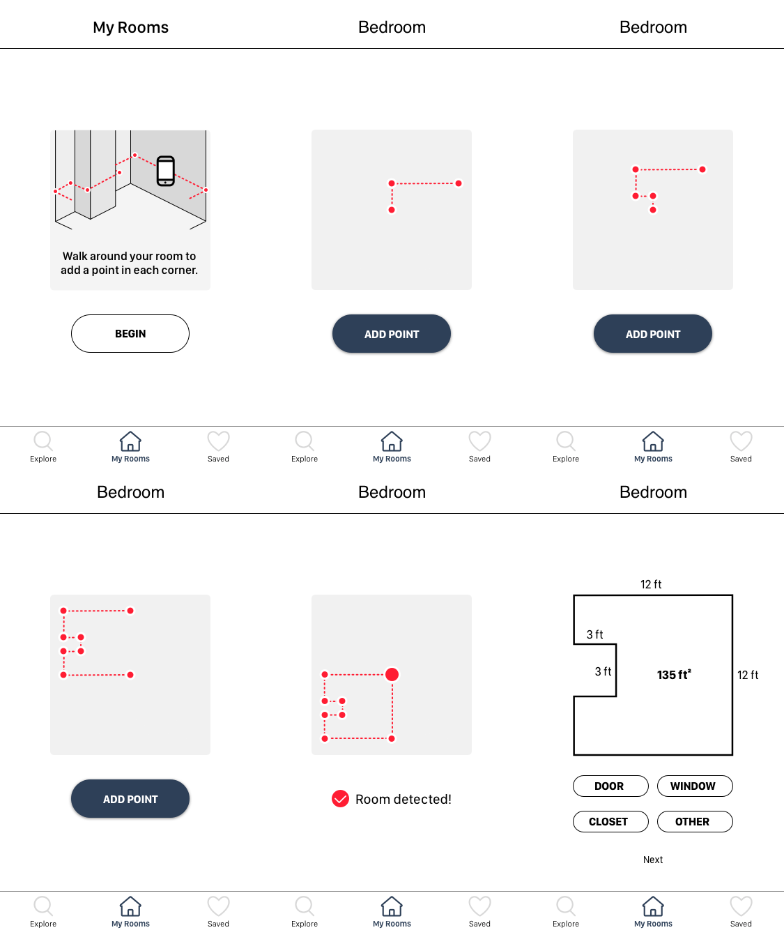
IA ROOM MEASUREMENT
User can tab “Begin” once they
are ready to use the detector. Once the shape of the room is detected, a reminder will pop up. If user decides to add windows, user will tab “window” button and the tab will change to “Begin”. At the same time, a brief instruction appears to show user how to add the window(s).
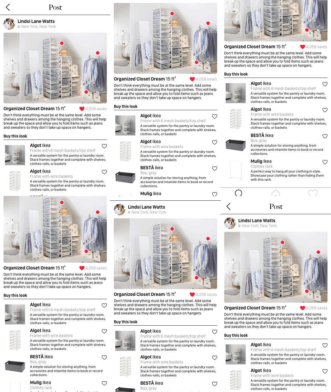
SUGGESTED ITEMS
User will get a list of suggesting items that may help to better optimize their living space.
ON BOARDING
There are four on-boarding screens. Each dot represents one screen. Dot is highlighted when user is on the corresponding screen. User can swipe right to view the next screen.User can also press “skip” if they choose not to go to the main page without reading the tutorial.
Animated prototype
Animated prototype
Animated prototype
Animated prototype
USABILITY TESTING
HI-FI PROTOTYPE TESTING
After completing our Hi-fi wireframes we tested our clickable prototype on 7 users. Here are the testing results.
Completed the tasks with minor issues.
5/7 Users
Expressed the app is delightful to use.
7/7 Users
Easily identified the functions of the app.
6/7 Users
Shows their interests in using the app in the future.
5/7 Users
DESIGN
STYLE GUIDE
Considering our target audience, we wanted to give the users a sense of calming and stability. We created a visual direction and style guide ensured our design theme is consistent across our designs.
HEX#
ABB3BC
HEX#
2E4058
HEX#
EE6467
HEX#
FAE7DD
Add a Room Feature
COLOR
TYPE

UI ELEMENTS

NEXT STEP
PARTNERSHIP

X

Partner with HGTV: We would like to partner with HGTV is a cable and satellite television channel that focused on helping users to solve their organizing problems.
Sign in & Sign Up Screen: We are planning on building a Sign in and Sign up page to store our user’s data and preferences.
Integrate "Drag" feature to "Room Layout" Screen: We will integrate a feature that allows the users to drag furniture icons within the layout page so users can still arrange their furniture layout after our optimize layout suggestion.
Allow users to customize their items(size,Material & color): we want our users to be able to visually customize their existing items by editing size, color and material appearances.
LEARNING
It’s better to face to problems than walk around it: In this project because we didn’t want to step on each other’s toes, instead of discussing the real problem we were trying to be friendly. I wish we had a debrief at the end of everyday and give each other a safe space to express their concerns.
If you feel something say something: It’s important to speak out to your teammates right the way when you have uneasy feelings or concerns. I learned that I need to communicated my concerns right away so we could fix problems at the earlier stage.
Do not undermine research: Because we did not spend enough time on our user interview and synthesizing data, our team was not on the same page of understanding users’ pain points and needs. I learned that I am not my user, without U there is no X. Without research I can not solve a problem for my users I am just solving a problem for myself.